Bubbly Soaps
Bubbly Soaps
Design for Production
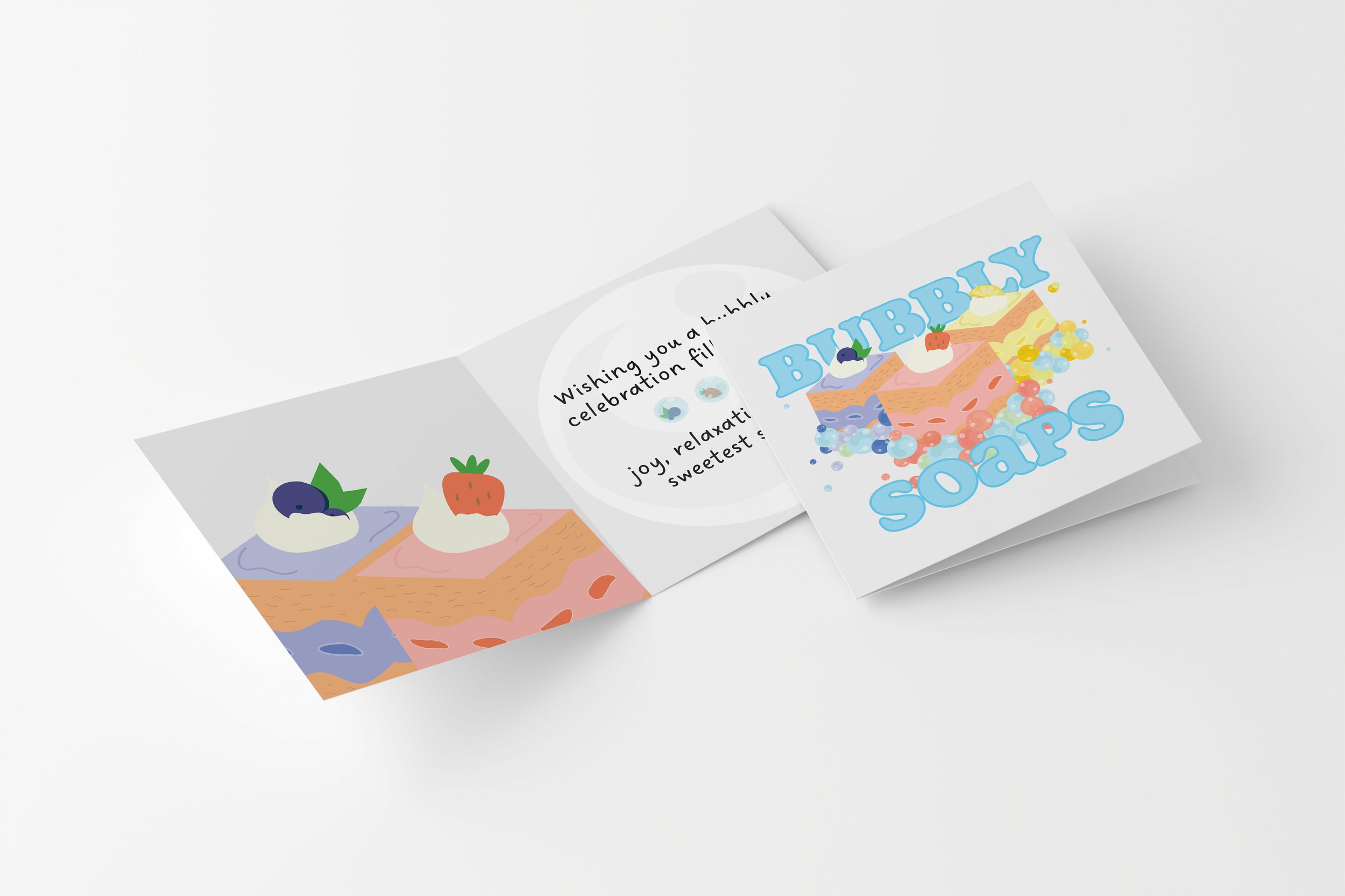
This project proposed the task to design the identity and surface graphics for a branded boutique range which involved developing three different variations of a product. I created Bubbly Soaps, a brand that packages soap in the form of petite cakes: Strawberry Fizz, Lemon Sherbet and Bubbly Blueberry. The project also required to develop an accompanying folded sheet with the product range in which I created a thank you card replicating characteristics to a birthday message.
Additionally, this project showcases my skills in the following technical areas:
Illustrator, Photoshop, InDesign + Acrobat
The Challenge
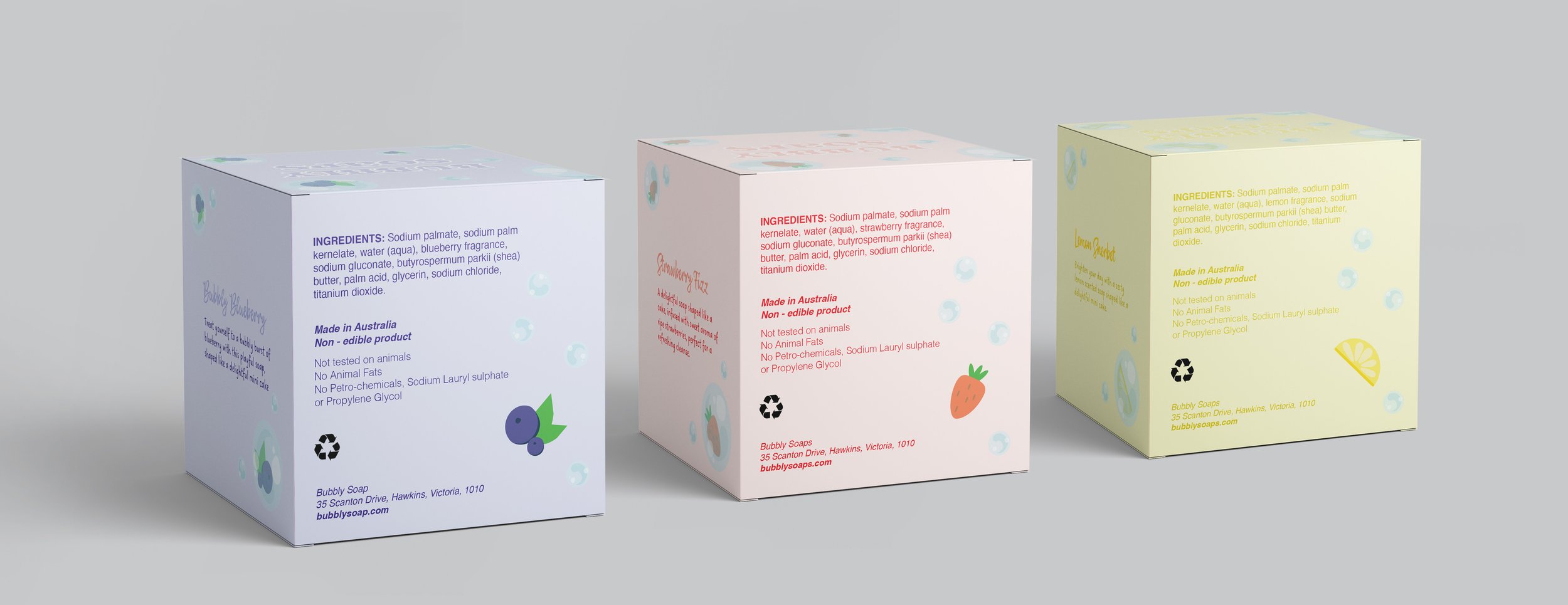
Design a series of 3 packs in the supplied die line with each box containing a different variety of one product. Accompanying the box is a folded sheet of paper which is to be printed double sided. The function of this sheet of paper is up for a range of possibilities. Each box is also required to have a distinct colour signature. The packs and folded sheet should incorporate a considered element of ‘overprint’ and a considered element of ‘knockout’.
The Outcome
The final outcome of this project is a series of three soap packaging designs for "Bubbly Soaps," inspired by dessert aesthetics. Each box, measuring 70mm x 70mm x 70mm, represents a different flavour—Bubbly Blueberry, Strawberry Fizz, and Lemon Sherbet—with a cohesive yet distinct visual identity. The packaging features soft pastel tones, playful typography, and illustrated elements that reinforce the concept of soap as a sweet indulgence for the skin. The design balances a fun, whimsical approach with a clean and modern aesthetic, making the product visually appealing and market-ready.
Delivered
Package Design
Year
2024

I began my initial research by exploring various products and brands that interested me, ultimately narrowing my focus to cakes.
From there, I created a mind map central to this topic which then expanded into different design direction possibilities.
Moving forward, I researched into surface graphics on packaging that was specific to my chosen product to help inspire my own design direction.
From there, I analysed potential target markets, identifying key traits and characteristics of consumers who would be most interested in the product.
This research then stemmed into potential style cues, colour palette, imagery and typography exploration.
The Process
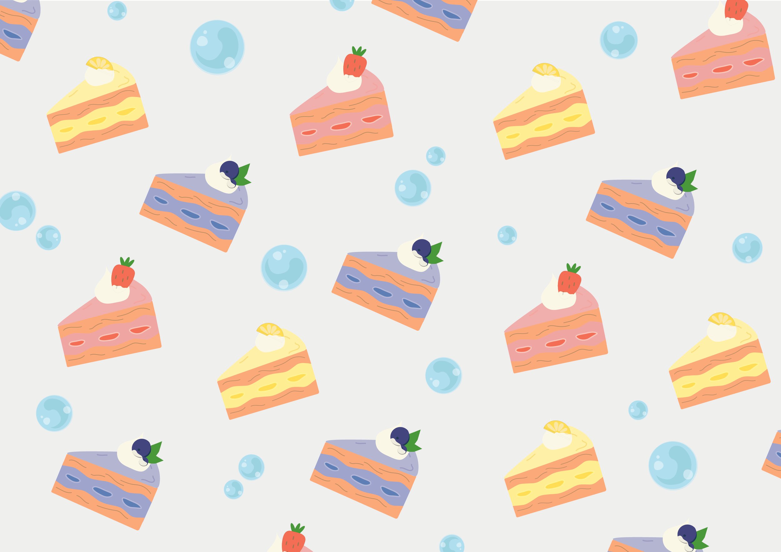
The illustrations were initially hand drawn and then digitally refined with colour and texture in Illustrator.
The illustration style was inspired by kawaii aesthetics, characterised by its cute and loveable appeal, which aligns with the playful and whimsical nature of the product.
As the project also required to develop an accompanying folded sheet with the product range, I created a thank you card replicating characteristics of a birthday card with the message, ‘wishing you a bubbly celebration with joy, relaxation and the sweetest scents.’ This is with the intention for the product to be given as a gift to someone or to be kept for the consumer themselves.


Curious to see more?
Dive into my other projects or let’s connect!


