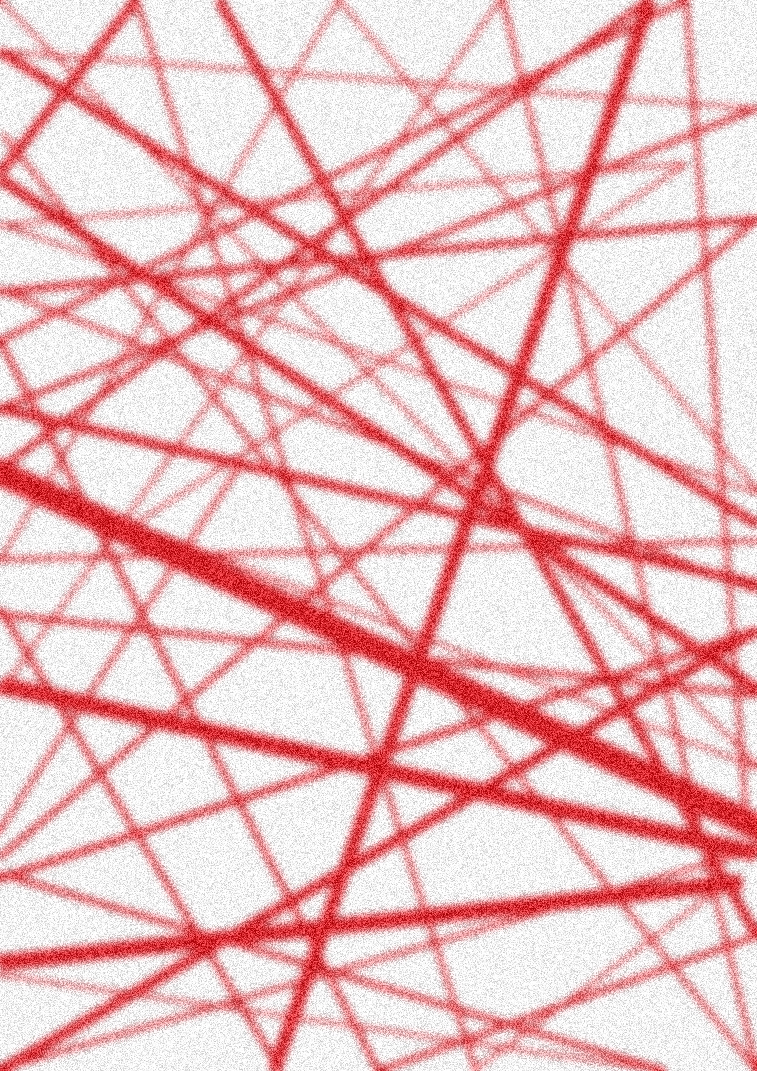
Discerning Reality
Discerning Reality
Publication Design
This project proposed the challenge to design a complex and expressive publication based on a selected text, offering significant scope for visual experimentation. It involved creating a visually compelling outcome tailored to a contemporary, design-aware audience while showcasing individuality and personal style. Using a flexible grid system, I balanced text and imagery to ensure readability and coherence across multiple sections. The work reflects advanced typographic skills, self-authored visuals and refined craft production, demonstrating a deep understanding of publication structure and visual language.
Additionally, this project showcases my skills in the following technical areas:
InDesign, Photoshop + Illustrator
The Outcome
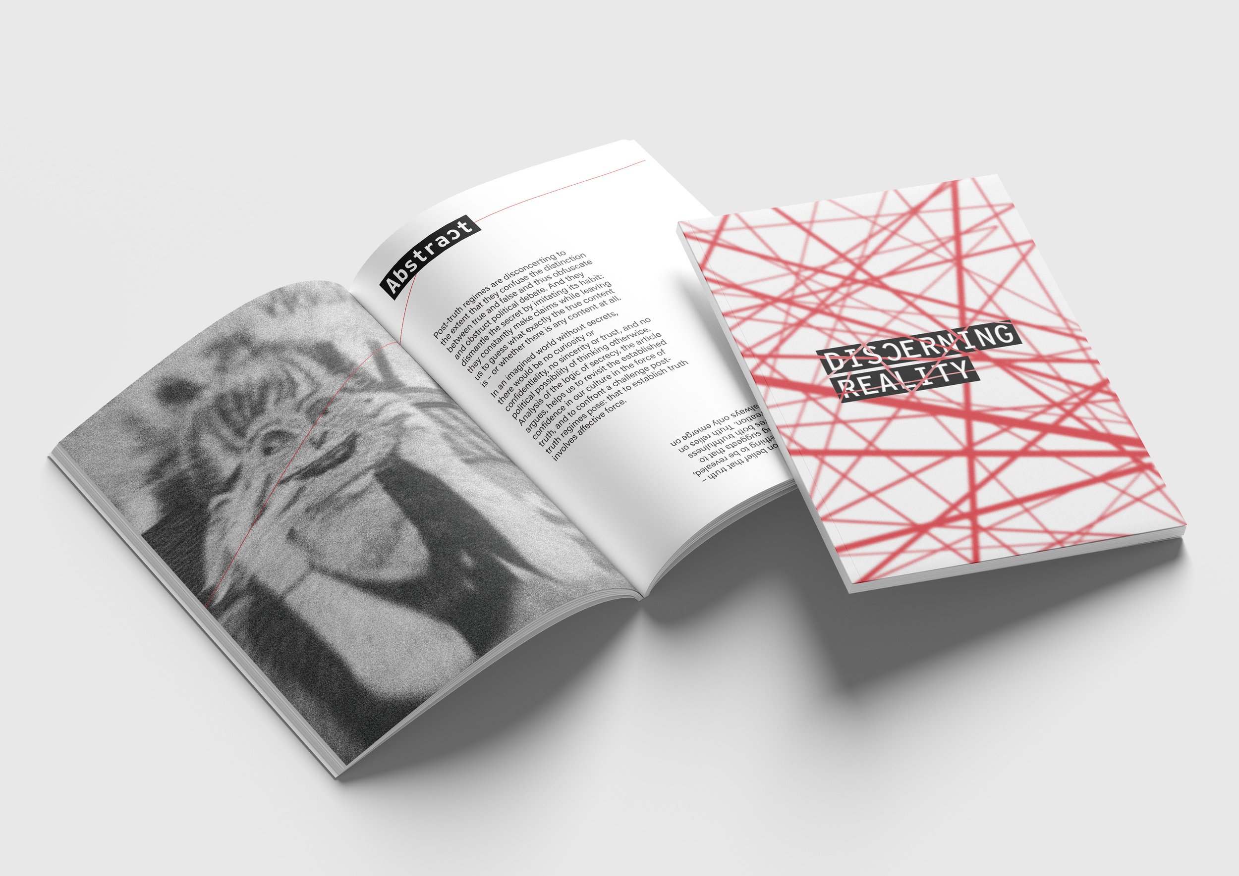
The final outcome of the publication is a 56-page, A4 vertical, perfect-bound book with a matte finish titled Discerning Reality. The publication explores the themes of the text through the central idea of truth versus falsehood, visually interpreting the tension between reality and illusion. Through a consistent grid system, striking visuals and thoughtful typography, it conveys the concept of deciphering reality from illusion in a world where truth is often distorted and manipulated.
The Challenge
Design a complex, imaginative and expressive publication based on a selected text. The following publication was based on the text, Secrecy and the Force of Truth: countering post-truth regimes by Suzanne Krasmaan.
Delivered
Publication Design
Year
2024
VISUAL CONCEPT
VISUAL CONCEPT
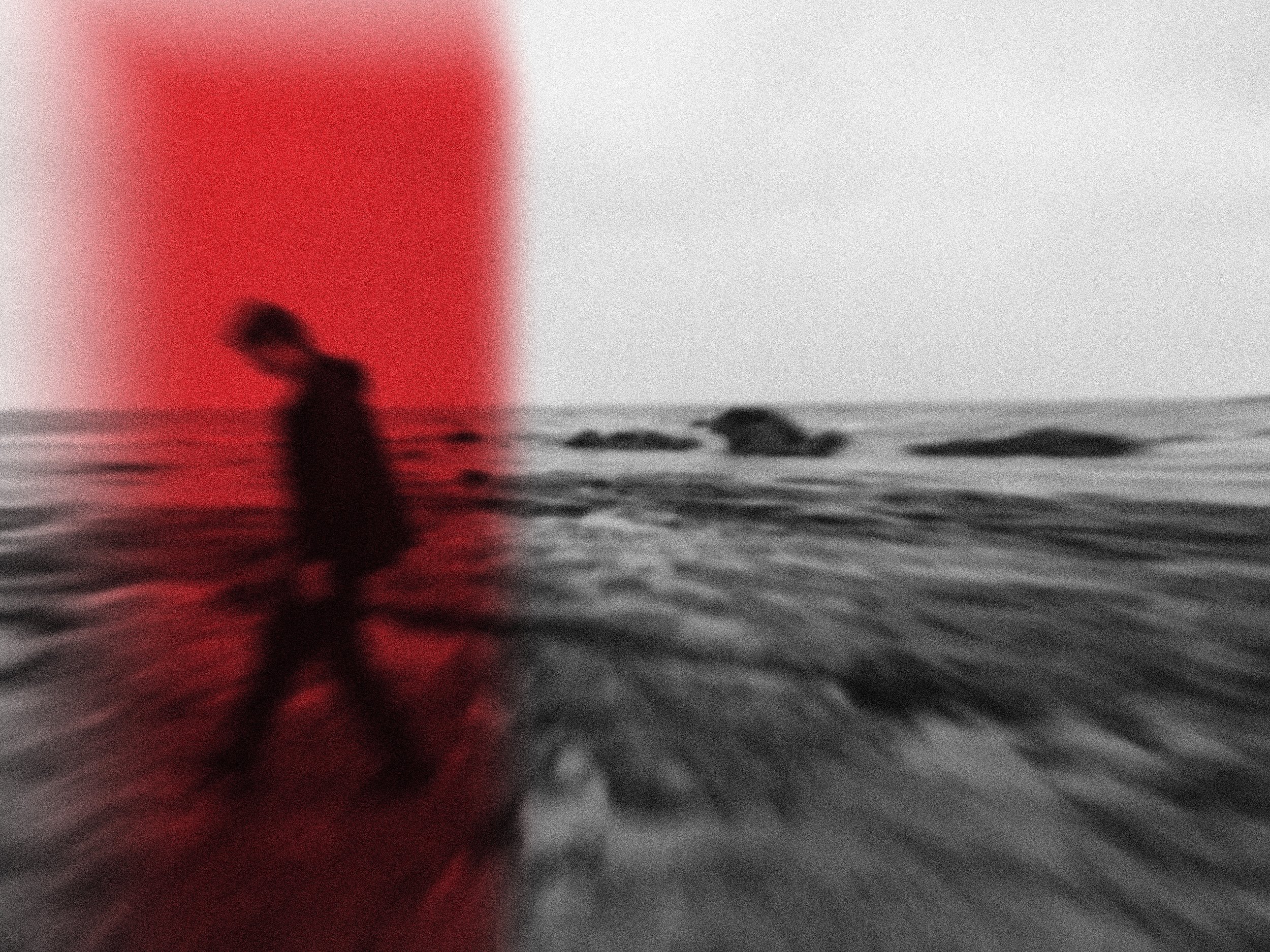
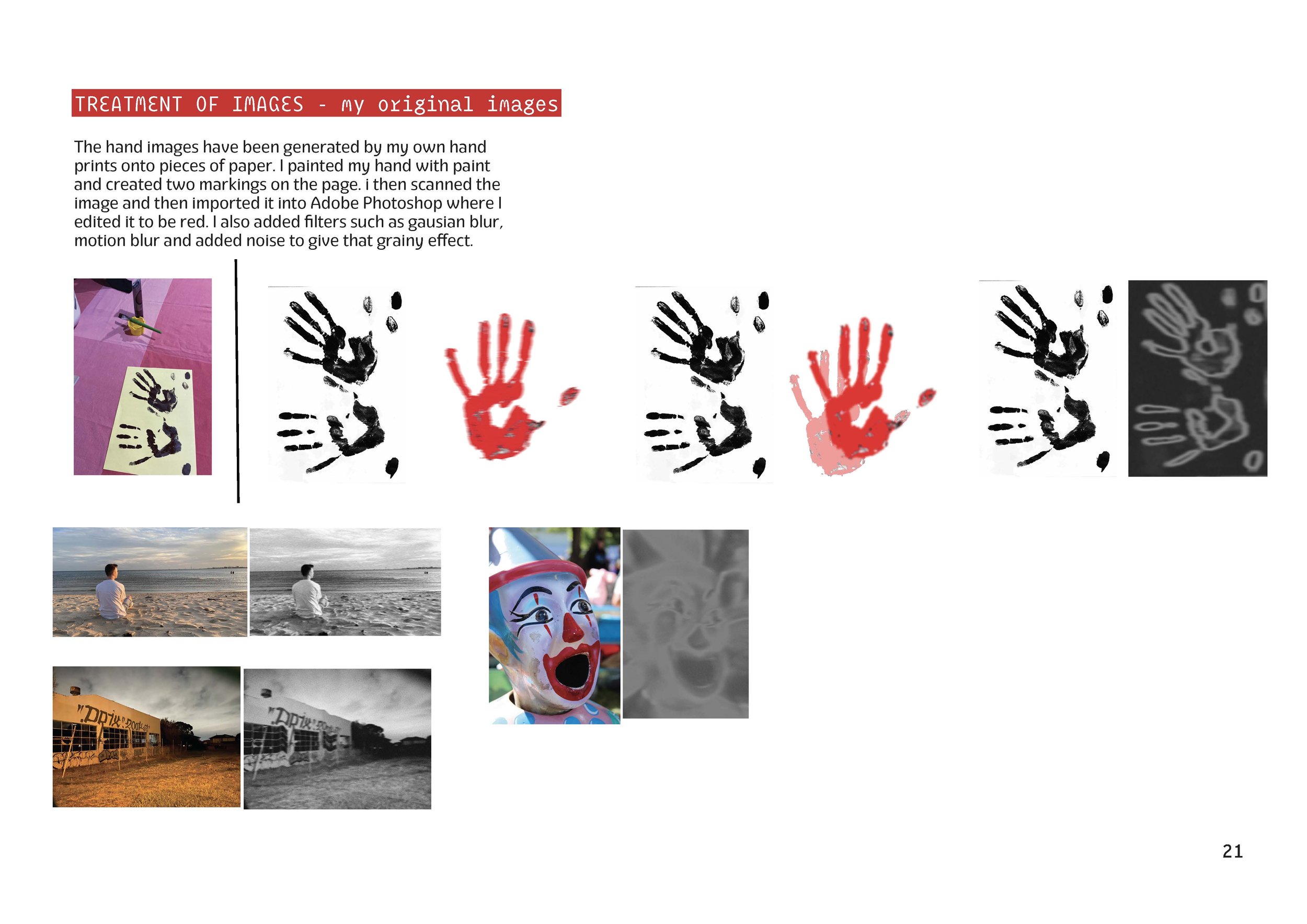
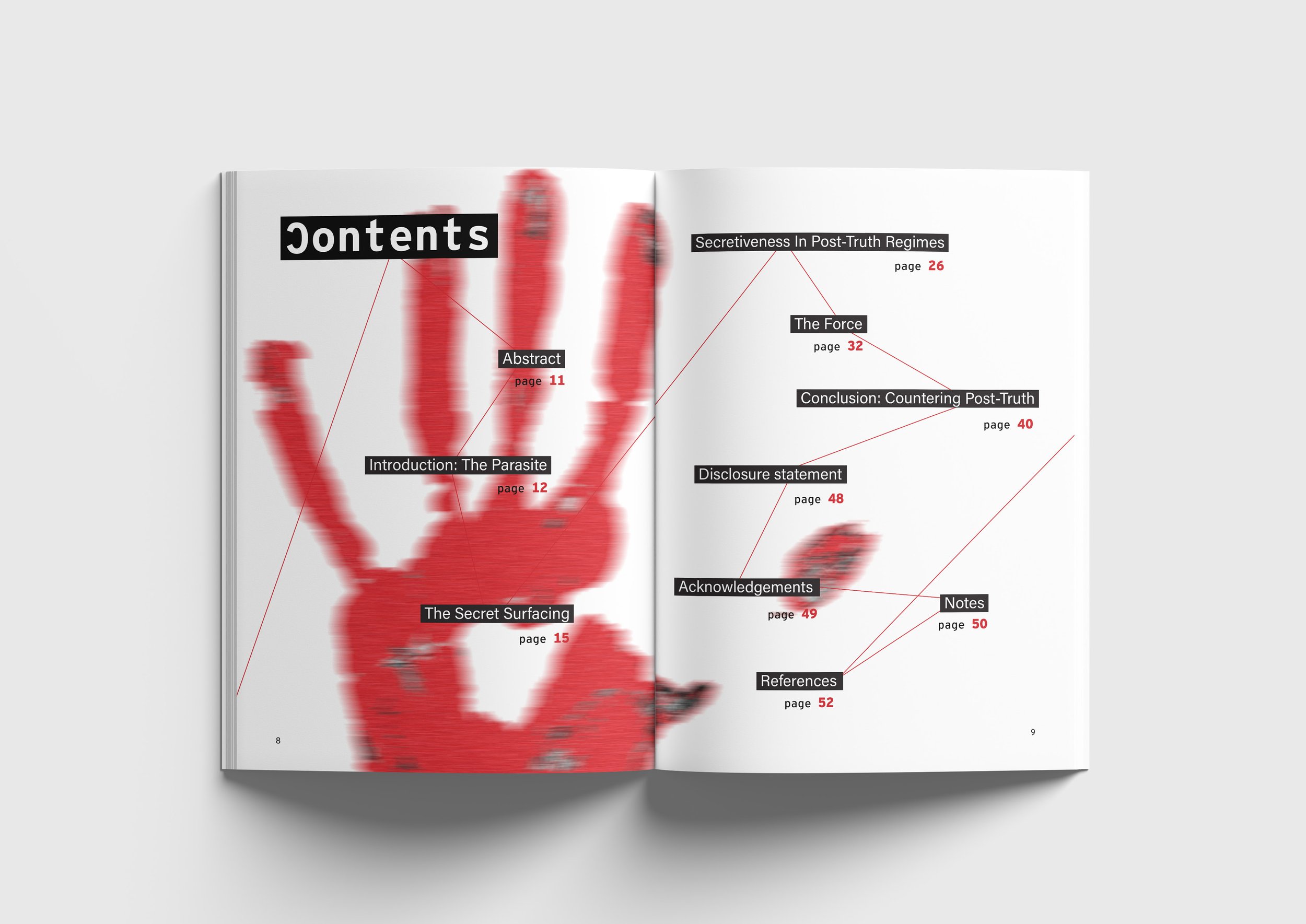
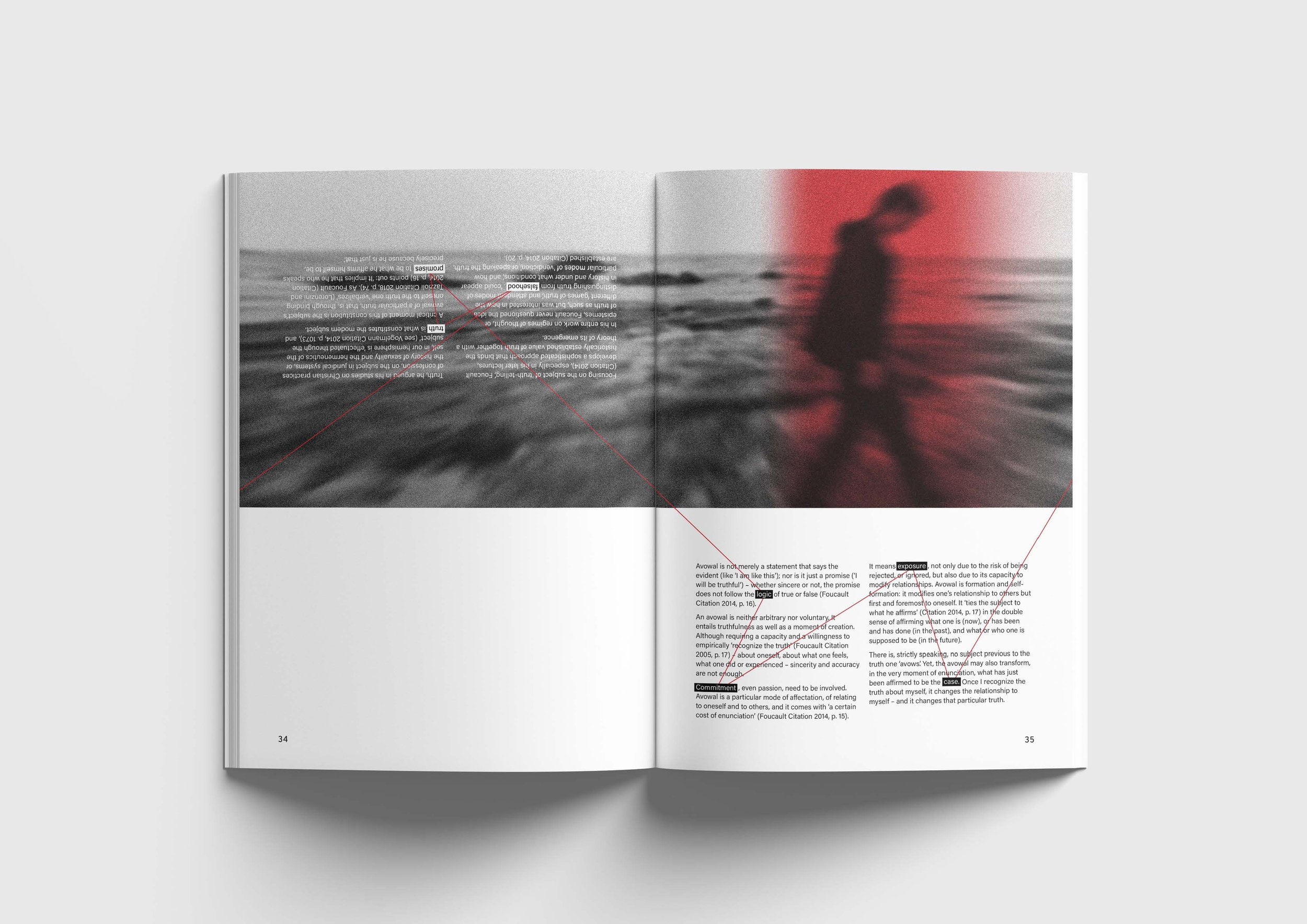
The overall visual concept derives from the idea of deciphering reality from illusion in a world where the truth can be distorted and manipulated. The publication explores manipulation of type and imagery which has been applied to enhance the texts key themes and narrative. Black and red have been selected to capture the essence of urgency, secrecy and the idea of control and power. A continuous red line runs throughout the publication, symbolising a “murder board string,” tying together clues like a crime-solving investigation to reveal the hidden truth. The imagery seen throughout the publication are my original photographs with limited being from online sources which have then been manipulated and refined in Adobe Photoshop.
The Process
I began by thoroughly reading the selected text and highlighted key words and quotes that could inform the development of a central visual concept. By analysing the text in detail, I created two brainstorm pages focused on potential concepts. This process helped me explore the text further, uncovering new insights and possibilities to guide the design direction.
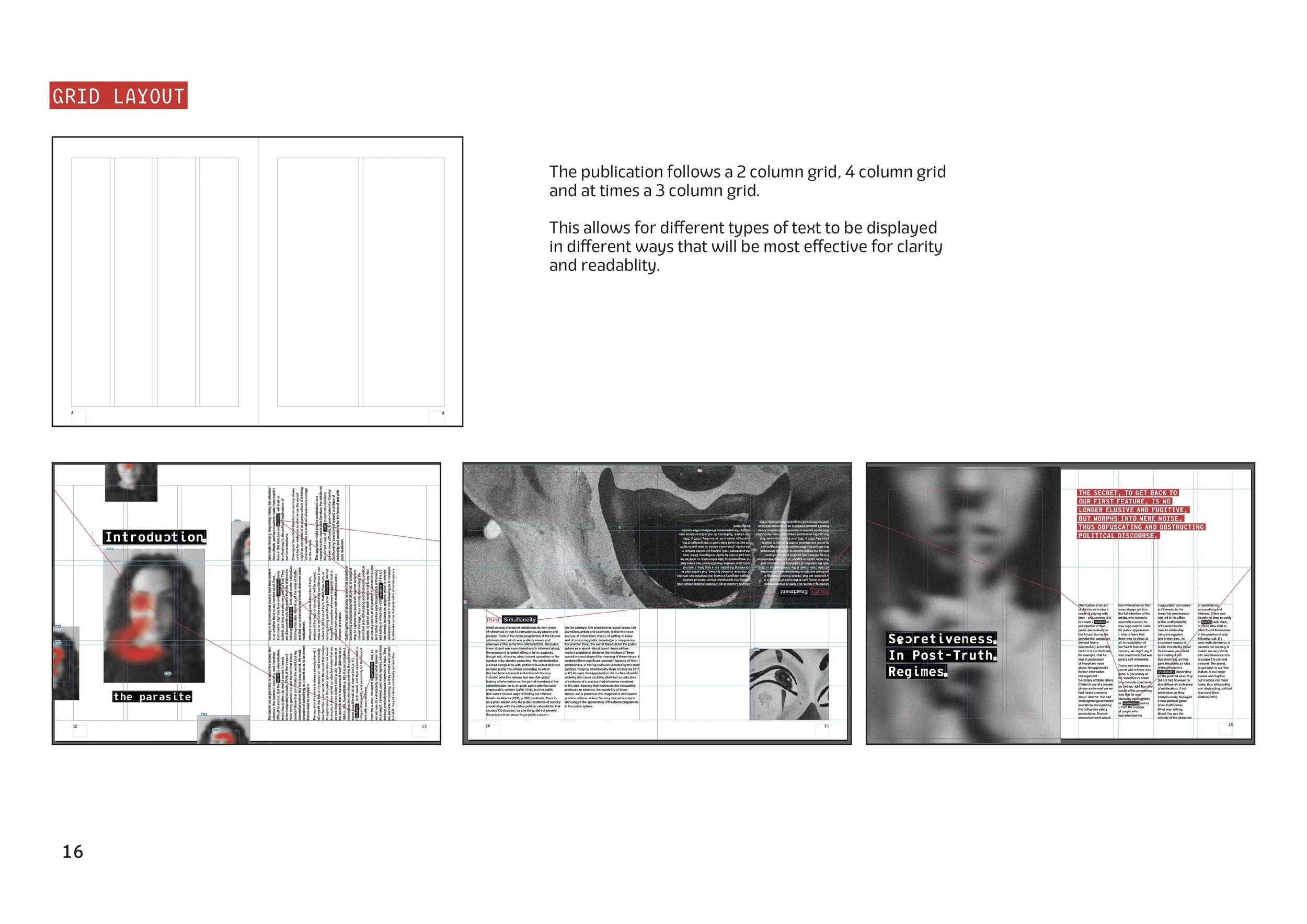
Furthermore, I then created visual moodboards from sourced imagery to assist in directing the visual direction. Stemming from these two concept ideas, I created a potential front cover and a two page spread to begin the initial process. Experimenting with different type, grid systems and imagery, this process allowed me to refine the overall visual language and layout.







Curious to see more?
Dive into my other projects or let’s connect!

